


Spotlight
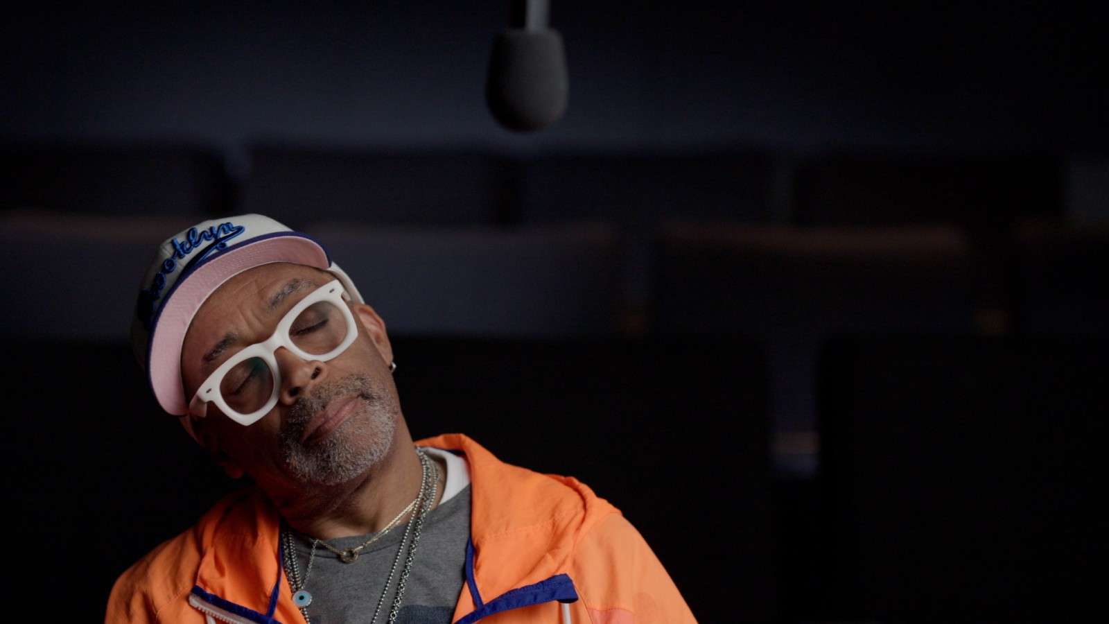
Under the Influence
In this ongoing series of videos, contemporary filmmakers talk to us about the movies that have had a lasting impact on their work.
The Criterion Collection
An online magazine covering film culture past and present
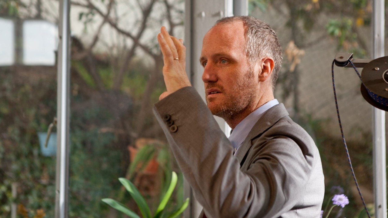
The filmmaker looks back on the experiences that have shaped his creative life, including his time in art school, his work as a graphic designer and music-video director, and his early interest in documentary cinema.
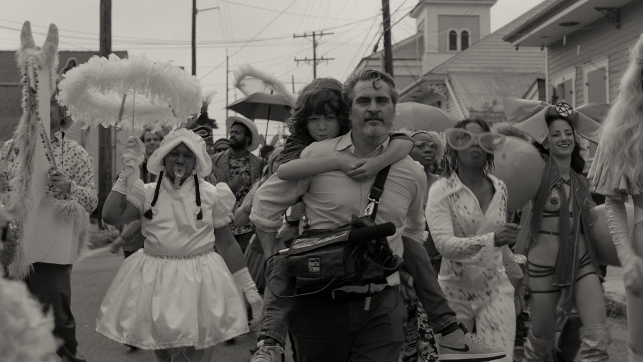
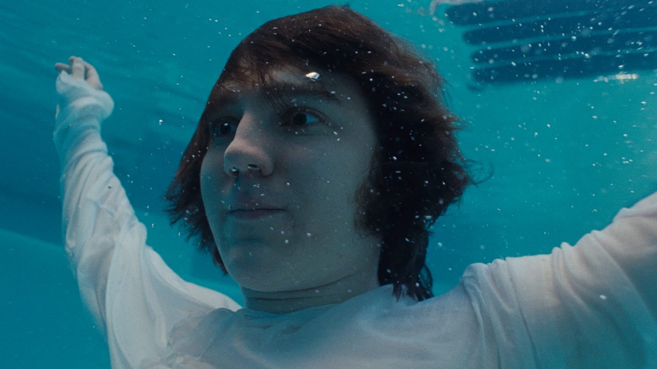
In his fiction features Beginners, 20th Century Women, and C’mon C’mon, the acclaimed director casts a sensitive gaze on the rich psychodynamics of human relationships and the hidden interconnections of our unconscious motivations.
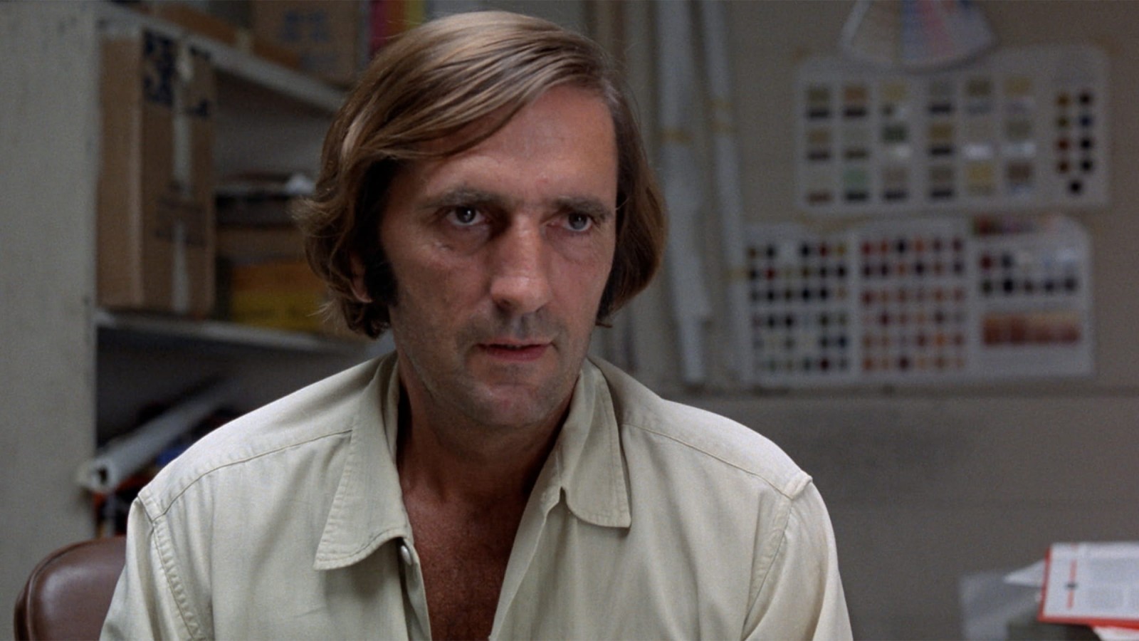
In one of his greatest performances, the celebrated actor shows off his range by fusing the two modes that defined his career: the misanthropic provocateur and the soulful survivor-witness.
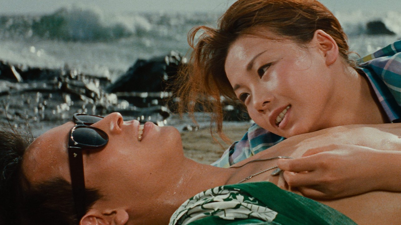
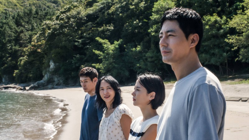
In his second feature film, Nagisa Oshima explores the alienation of young Japanese people and their doomed attempts to assert themselves in a corrupt and increasingly conservative society.
Among this month’s highlights are a collection of rock biopics that go beyond cliché to explore the elusive place where inspiration sparks and musical legends are born.
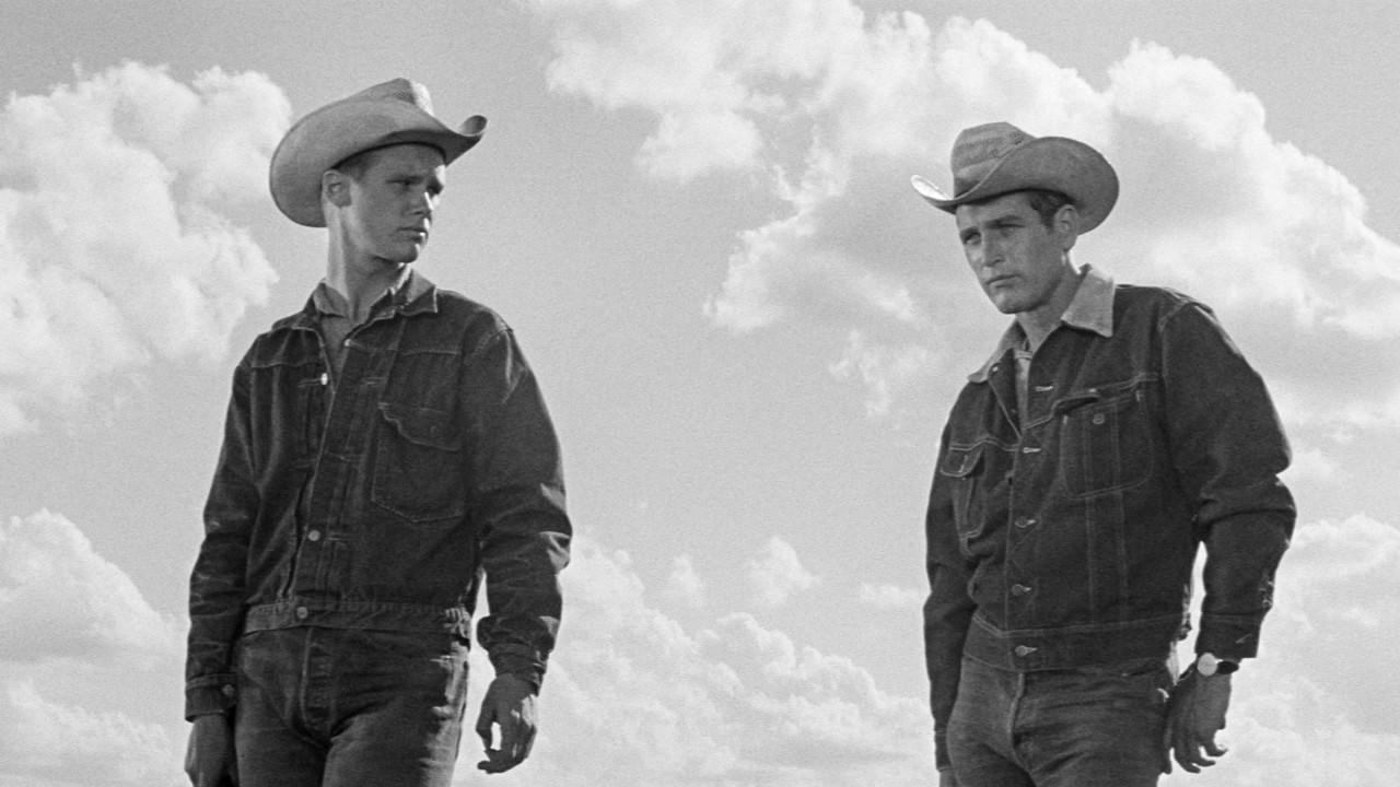
A career-altering artistic breakthrough for director Martin Ritt, this dark tale of a family’s downfall daringly exposes the mythology of the western hero as empty and morally bankrupt.
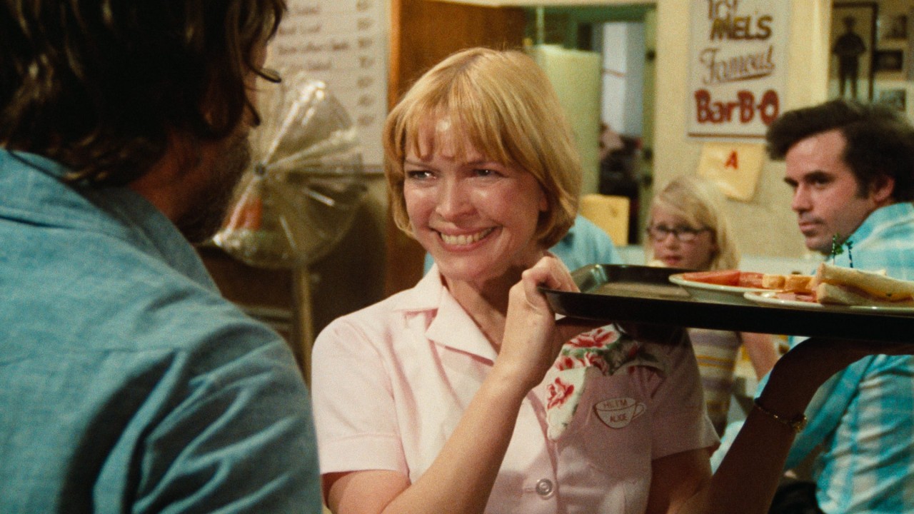
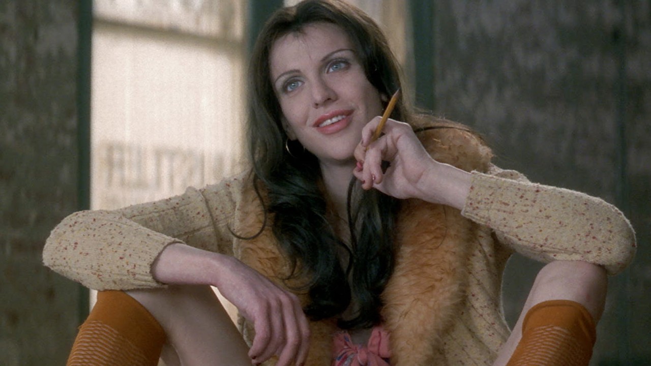
Made in close collaboration with its star, Ellen Burstyn, Martin Scorsese’s first film for a major studio is a warm, openhearted portrait of a woman who endeavors a drastic reshaping of her life.
Though it became the subject of cultural hysteria upon its release in 1992, Neil Jordan’s film can be appreciated today as a rare and remarkably nuanced depiction of a cisgender man and a trans woman falling in love.
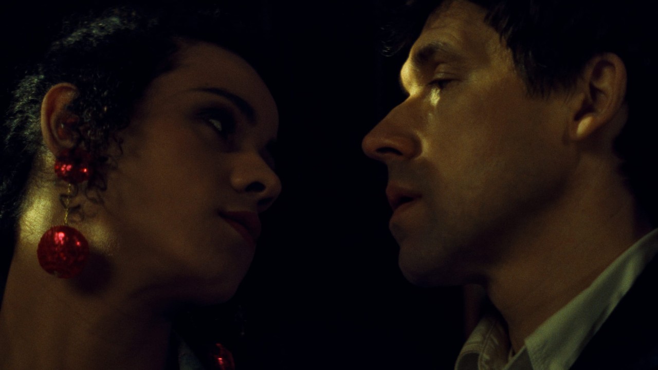
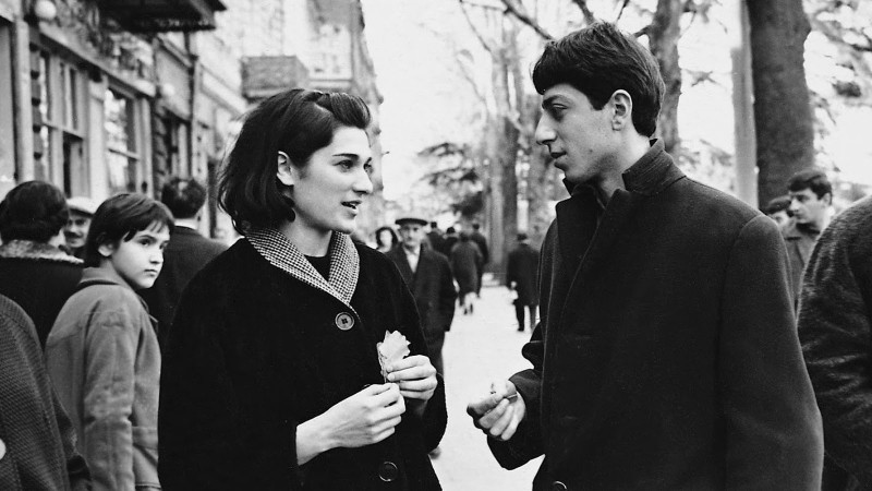
Neil Jordan achieved major international success with this complex exploration of identity and desire set against the turbulence of the Troubles in Northern Ireland.

A characteristically rebellious work from the Czechoslovak New Wave pioneer, Wolf’s Hole explores the perilous absurdities of groupthink through the story of eleven youths held captive at a skiing retreat.
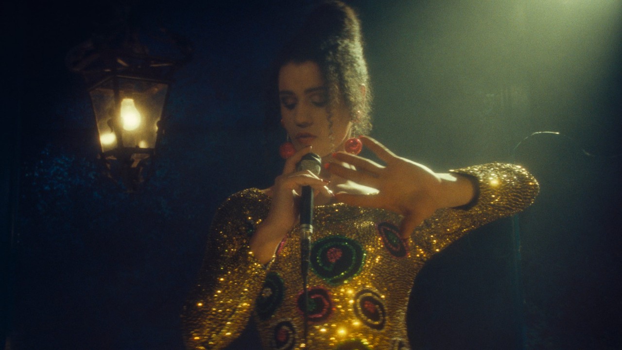
The beloved rock musician reflects on her formative experiences as an actor and her close collaborations with directors Miloš Forman and Alex Cox.
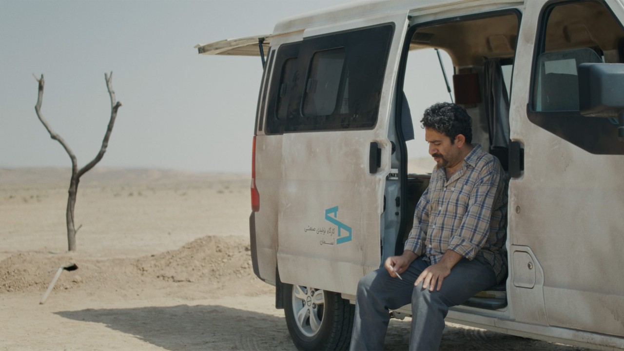
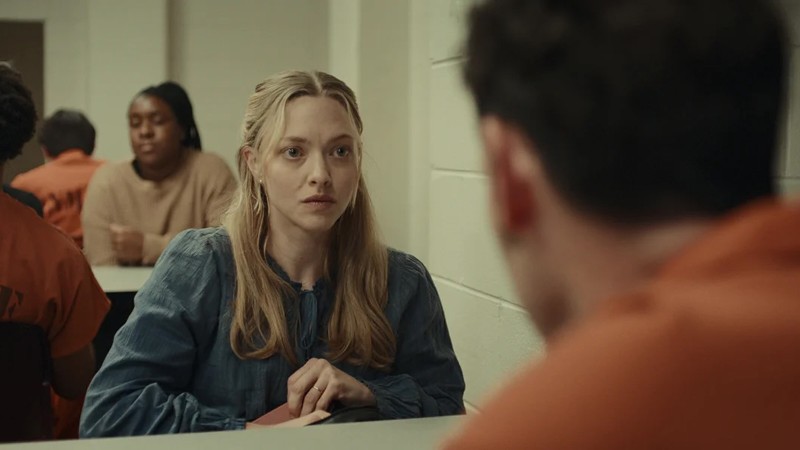
Shot clandestinely in Iran in just twenty-five days, Jafar Panahi’s acclaimed eleventh feature is a philosophical examination of political ethics that transforms into a comedy of manners and a psychological thriller.
Spotlight
In this ongoing series of videos, contemporary filmmakers talk to us about the movies that have had a lasting impact on their work.


