Defogging Wanda

In early 2007 the UCLA Film & Television Archive received a call from Hollywood Film and Video announcing that the lab was, sadly, closing—and clearing its vaults in two days’ time. Anything left was doomed to the dumpster. The next morning a group of us arrived to see what we could salvage.
Walking through the musty basement, dank stairwells, and narrow aisles was like walking through a shuffled deck of cards: artifacts from the 1950s to the present lay atop each other, in seemingly unknowable order. The only light came from a few incandescent bulbs hanging irregularly amid the dark corridors of shelves, casting a yellow glow that dropped quickly into shadow. Aging equipment was everywhere, some still functional, some showing years of rust, dust, and corrosion. Puddles of oily water lurked underfoot reflecting sickly rainbows, and the smell of old chemicals and mold hung in the air.
The films lay about in differing arrays, long forgotten by their makers: B, C, and D movies, industrial films, commercials, printing tests, and the stray experimental short. We began making piles to save in our collection.
In one aisle, buried in a large stack on the floor, I found some 16 mm reels labeled “WANDA. Harry Shuster.” Who on earth was he? Surely this couldn’t be the classic independent film by Barbara Loden? Her name was nowhere to be found on either the boxes or the leaders. Taking no chances, I kept the oddity apart from my other discoveries; in fact, I took it back to our lab in my own car.
Immediately unspooling the reels on my workbench upon arriving, I realized we’d uncovered a piece of history. It was that Wanda—and no less than its original camera rolls. Harry Shuster, as I’d guessed, was the film’s producer. One more day and it would have gone to landfill.
But how to fund a restoration? Enter The Film Foundation, which has saved so many classic works over the years. In coincidental great timing, they’d recently begun a partnership with Gucci, whose express aim was preserving works by women visionaries. And so our work commenced.
At that time digital restoration was advancing rapidly but had not yet overtaken photochemical printing in archival practice. Thus our work would be on good old-fashioned film, at least initially. We began as Loden had herself, with a blow-up to 35 mm. But our route quickly began to vary. The exact stocks she used no longer existed, and their “official” replacements were problematic, increasing contrast and distorting color.
A crucial component of Wanda’s production, as I found in the camera rolls, was its Kodak Ektachrome ECB (7242) film stock, which has a unique color palette completely unlike Eastmancolor negative, Eastman Commercial film (ECO), or Kodachrome. In a stroke of luck, the bulk of the film was on this, and unfaded.
After
extensive testing at Cinetech Laboratory we decided to avoid Kodak’s designated
internegative, a holdover from a
previous era that was not optimized for printing from projection-contrast
film. We instead printed the reversal camera rolls to a
low-speed negative camera stock and used pull-processing to reduce contrast—as I’d successfully done on a number of past titles.
It’s interesting to note that in the intervening years, Kodak abandoned
the interneg I nixed in favor of the camera stock. But this was years before
that took place, and the result was stunning color.
Ironically, this led to what might strike some as an archival quandary. While the new color closely matched the original rolls, it was in fact much better than the old distribution prints, which apparently looked awful. To quote an early review in the British journal Films and Filming by Gordon Gow:
For the first couple of minutes, I thought it was all a ghastly mistake, this terrible muzz-colour . . . But soon it became obvious that Barbara Loden meant it to look messy, as if real life had been recorded perchance by an amateur photographer with cheap film and poor laboratory facilities.
It’s a nice interpretation. But was it valid? In Film Journal’s Summer 1971 interview with Loden, I found this:
Ruby Melton: The color in the film often has a washed-out, grainy effect and the lighting is sometimes very dim. Were these effects intentional?
Barbara Loden: Unless you have your own laboratory, it's difficult to control the quality of the color. In our original print the color looked extremely good, but later prints made by different labs were not such good quality.


In this slideshow, one can compare 1.33 and 1.66 versions of the same shots. The 1.33:1 samples are scanned from the restoration blow-up internegative, and the 1.66:1 samples are from a prior DVD release, which was transferred from an old internegative. The samples illustrate how Wanda was shot safely for both aspect ratios. While the majority of the film has headroom suggesting widescreen intent, problematic moments arise. Note as well the qualitative difference between the sources. Both are only one printing generation away from the original 16 mm reversal camera rolls, but the restoration negative has substantially finer tonal detail. The old internegative also exhibits color pollution in its grain pattern.
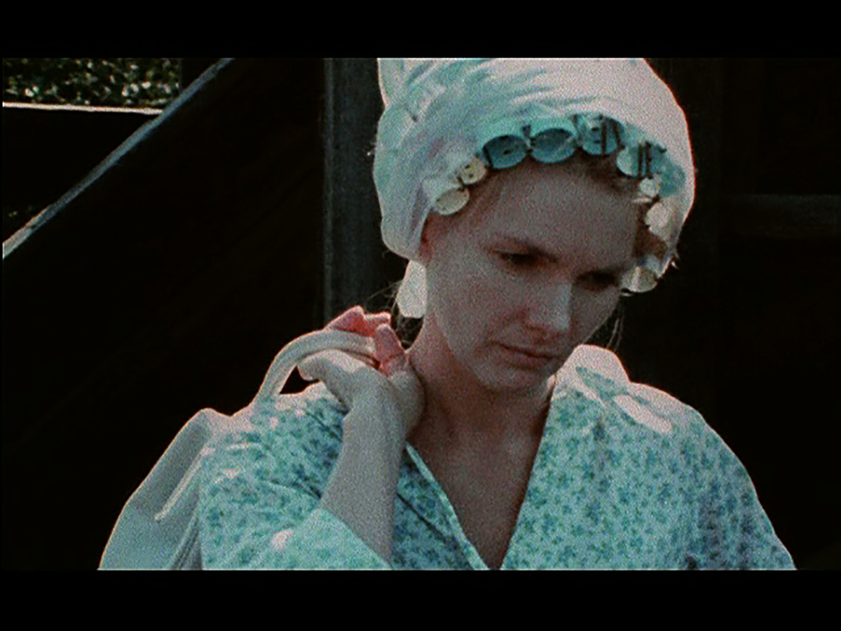
The above shot is in 1.33:1—classical composition with Barbara Loden’s head vertically centered and fully depicted.
1.66:1—cropped. 1.66 framing was likely intended (and successful) due to the vertical frame level of Loden’s eyes and her position frame right, but the shot is less balanced than the 1.33.
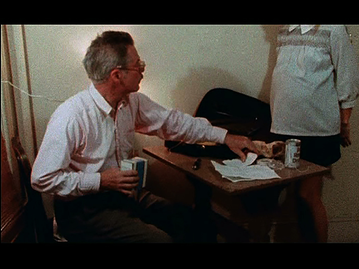
1.33:1—Loden is fully framed within the shot.
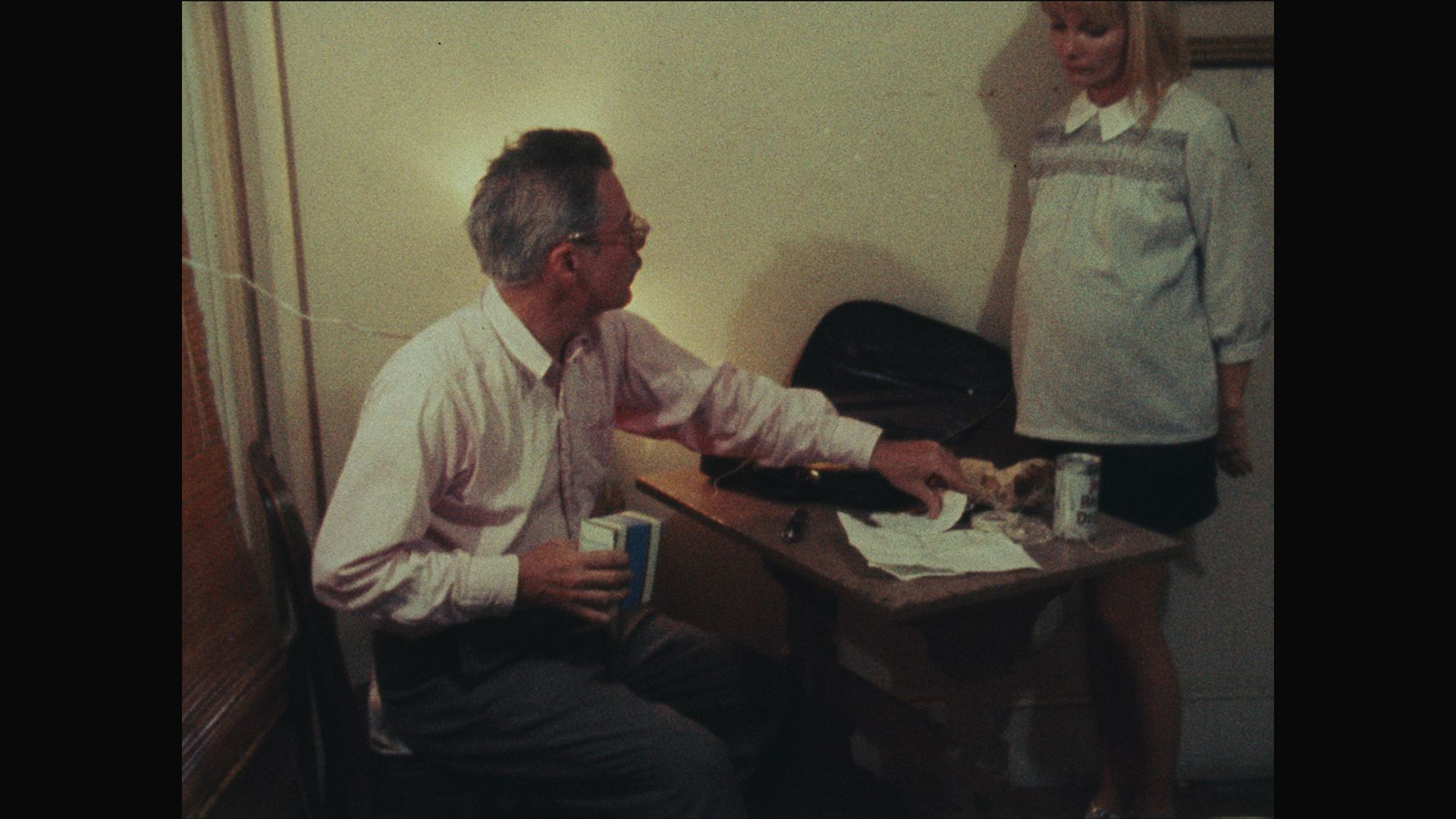
1.66:1—cropped, with Loden’s head cut off. This shot features extensive motion that the camera tracks, but due to the unpredictability of action, it occasionally loses track of important compositional details. It’s still successful at 1.66, as the pillow in Loden’s shirt and Michael Higgins are the intended points of emphasis, but the framing results in a slightly distracting awkwardness.


