Transposing To Sleep with Anger to Paint

Thanks to Charly Palmer, our edition of To Sleep with Anger certainly catches the eye. The Atlanta-based artist, who illustrated our cover for Charles Burnett’s long-underseen 1990 film, has for years been renowned for his vibrant, densely layered depictions of African American history and experience. And it was the intricacy and vitality of his work, much of which draws on social iconography and incorporates bits of text in a collagelike fashion—including group portraits of subjects as varied as musicians at work, voters in line, and picketing protesters that are often emblazoned with significant dates, slogans, and other words—that led Criterion art director Eric Skillman to reach out to him about To Sleep with Anger, a tale of family and tradition as thematically dense as Palmer’s paintings and illustrations. The image that the artist ultimately came up with is a tribute to Burnett’s vision, capturing the poetic-realist film’s complexities in a sprawling, warmly hued mosaic of scenes and symbols that communicate the film’s offbeat folkloric tone and hint at the broad contours of its plot (in which Danny Glover’s enigmatic southern charmer threatens to pry apart the family he pays an unexpected visit in South Central Los Angeles). With the edition of To Sleep with Anger out now, we called Palmer to talk about the process of creating the cover.
Tell us what made you want to take on this commission. It’s such an amazingly dense, energetic image that you came up with, and I imagine there were a lot of layers to its conception.
One of the things I’ve always wanted to do, and that’s why I went to school, is book covers and movie posters. When Eric contacted me initially about doing the illustration, it was one of those things, I’m sure, of finding me on social media, because I’d never done it before, and inquiring whether or not I’d be interested in doing it. What I loved about it is that I had seen the movie years ago. I loved it, but I had never dissected it. So having to go back and revisit the movie was very helpful to me, and also informative. I saw it was a very complicated story. I submitted several rough sketches initially, and because there is so much going on in the movie, I felt that a montage was the best way to depict it.
I read that you often paint from photographs as well. Did you use them during this process?
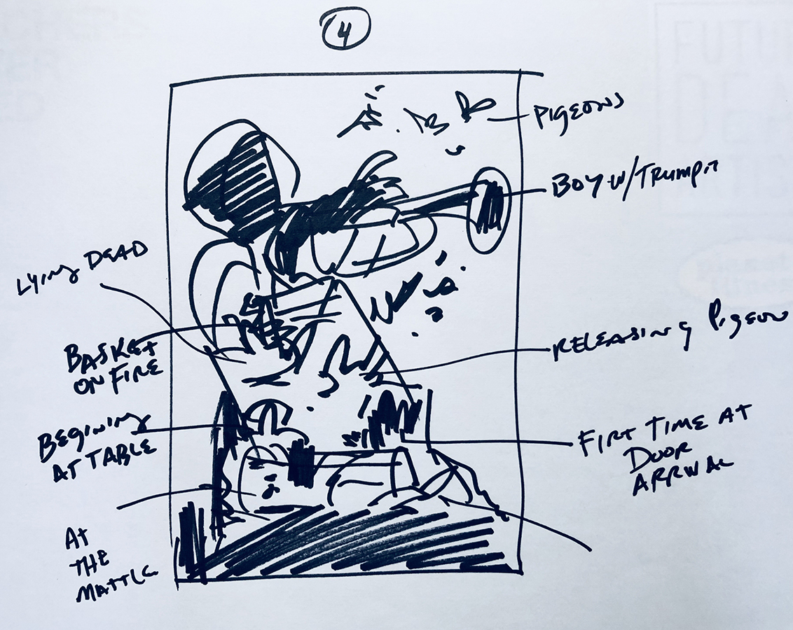
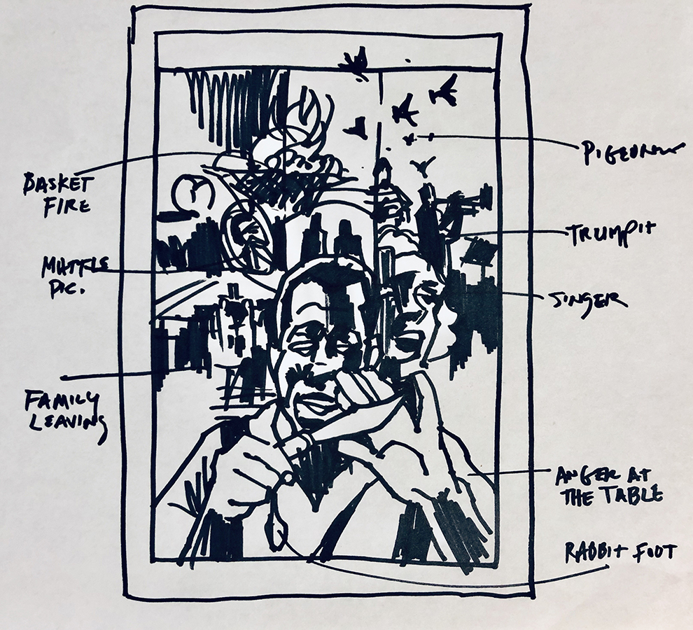
Very much so. I had to do a lot of screen captures. And that was the other reason I watched the movie probably five or six times. I made notes as to where certain things took place, because I was trying to figure out moments in the movie where it changed or shifted. The challenge was to limit the amount of things I depicted—you don’t want to tell the whole story. But there are [images] throughout the movie that keep coming up . . . and they must be symbolic of something, so I had to find a way to tie those into the overall story. In one scene, the main character explains an ongoing theme throughout the story, and it was the aha moment, so that had to be a part of my illustration. It’s the kid playing a trumpet. Someone says something like, “That kid playing the trumpet is irritating, but in order for him ever to become good at it, he has to play over and over again.” And that makes perfect sense. It’s about learning your craft. In the beginning it’s not going to be the greatest thing, but in that effort you may someday achieve greatness. That’s a very important message throughout the whole story.
What are some of the other things, just in the experience of watching the film, that you knew you wanted to convey on the cover?
I think a very crucial moment is the arrival of the main character, when he first enters the doorway, and how it sets a mood of discomfort . . . That arrival shifted everything in the movie, and so that became very important to the whole story. And then there was an energy between the main character and the mother’s best friend. You got a sense from watching the story that they had a past. So I wanted her to be in the illustration . . . If you look at the scene of the woman to the right [on the cover], it looks like she may be screaming—she’s actually singing. I want you to get an uncertainty about what her emotion is at that moment. That was very intentional—you don’t know unless you’ve seen the movie. That’d be one of the things that’d entice you to see the movie: What is she screaming about? What is she upset about?

Early sketches of the cover illustration

How do you see the finished cover as being similar to or different from your other work? I know it keys into many of the same themes. But a lot of your work is also more explicitly historical or political.
I think the one difference is I really wanted to pursue it more like I would do a regular fine-art piece [rather than a typical commission]. Because it was trying to capture so much information, it became more of a challenge to approach it how I would normally approach something. What I wanted also to do—which happens very, very rarely in work that I do—is show a little bit of the initial line work. In certain cases, if I developed a theme too much, then it would take away from the overall collage or montage, so there was a conscious decision from the very beginning to leave parts a little bit looser: this part of the story is important, but not as important as the areas that are fleshed out more.
Earlier you mentioned your interest in movie-poster design. What were some of your influences, or some of the concepts that stuck with you from that interest?
One of the things that happened when the computer came into play [in the art world] is that Photoshop allowed anyone to do a montage image. But there were artists who came before that, like an artist by the name of Bob Peak, or Drew Struzan—Drew did Raiders of the Lost Ark and Star Wars, all these great posters. There were these collage images done in a very free-flowing, colorful illustration. I’m fifty-eight years old, and so back in the day as an illustrator, or an artist dreaming of being an illustrator, those were the kinds of things that inspired us, that excited us, and you don’t see much of that anymore in movie posters. And so I did see this as an opportunity to kind of go back to this thing I’ve always wanted to do.


More: Criterion Designs
Joao Rosa’s Experimental Approach to Designing Gummo
The creative director of Miami-based studio EDGLRD, which he cofounded with filmmaker Harmony Korine, describes the process of creating the cover artwork for Criterion’s recently released Gummo edition.

Capturing Arsenic and Old Lace, in One Macabre Image
To capture the spirit of Frank Capra’s dark screwball classic, Criterion enlisted a longtime collaborator to create an image that combines the influences of Old Hollywood illustrator Jacques Kapralik and legendary pen-and-ink artist Edward Gorey.

The Artistic Synthesis That Gave Bloom to Our Exotica Cover
For this new illustration, Spanish artist David de las Heras combined his signature use of bold colors with the lush style of French postimpressionist Henri Rousseau, a key visual influence on Atom Egoyan’s 1994 film.

David Plunkert Shares His Passion for Color and Shape
The graphic designer behind our covers for Diabolique and The Tin Drum takes us inside his Baltimore studio and his idea-driven creative process.