The Key Moment: Drawing a New Look for Notorious

I’ve done more than a few pieces for Criterion over the years, but Alfred Hitchcock’s spy-noir masterwork Notorious was on an entirely different level from the previous films I’ve worked on. Notorious was the very first Hitchcock I ever saw as a TV/movie-obsessed eight-year-old, and it remains my favorite, largely because of that lifelong nostalgia and the crush on Ingrid Bergman it gave me. It’s an exquisite story told deftly and brilliantly, and I love the volcanic suaveness of Cary Grant, the thorny elegance of Ingrid Bergman, the childlike danger of Claude Raines, and the spider-like manipulations of his ferocious mother, played by Leopoldine Konstantin. Notorious wasn’t my first noir, but it was the one that made me realize there was a whole world of film shot in rich and shadowy depths and anchored by pinhole shafts of light. At the time, I was getting interested in storytelling as my true passion, and I remember thinking, “I want to make something as good as this.”
Now, professionally, I’m not a film guy per se. I’m primarily an artist and a writer who uses his artwork to tell stories. When I’m working on a graphic novel or a children’s book, the depth and seriousness needed to execute the world I’m creating is definitely rewarding. But interpreting a film I adore is the joy work, the pure playground, and it’s far simpler. In many ways, it means surrendering the responsibility for it all and essentially becoming a cheerleader of the movie. Another reason working on Notorious was special for me was because the previous edition was the very first Criterion disc I ever bought. And I bought it for the cover—that black field with Bergman gingerly holding her poisoned tea cup . . . To be given the opportunity to improve upon that was both a terrific thrill and a profound challenge.

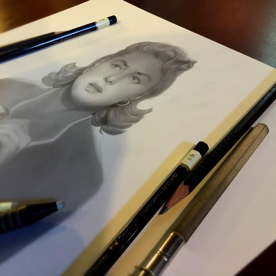
When Eric Skillman from Criterion got in touch with me to do this project, there was already a concept they wanted to pursue for the outer jacket: that moment in the film when Alicia (Bergman) is nearly caught stealing the key from her Nazi husband, Sebastian (Raines), to squirrel over to her secret lover, the CIA operative Devlin (Grant). So that shaved down a good amount of the fear about searching for a new way forward. The key, the hands, and the way Bergman uses her allure as a distraction—that’s where the tension in this film is most alive. I think if left to my own devices I would have chosen the same moment. It’s everything the movie does in one singular gesture. And it meant my work was going to be more about drawing this with the same elegance and beauty of the film, and getting the likeness exactly right.

Normally when I get an assignment like this, I watch the film on the screener copy to first see what it tells me it wants to do, unencumbered by past approaches. Then I’ll take a look at what has been done for the movie, both in the original artwork and recently within the fan culture, to avoid duplication and overused gimmicks. The fact that Criterion knew what they wanted meant skipping a lot of this process, and that allowed us to hit the ground running. There was also a tight deadline to meet, so we didn’t want the usual dozen or so thumbnails and sketches. We were drawing that hug, the hands, and the key. It wasn’t about the what anymore—we went straight into the how. And that’s where things got tricky for me.

Notorious is a film of pure Hollywood glam. Everyone in it is spectacularly cool and stylish. There isn’t a misplaced hair to be found and never a single word misspoken. Humanizing that while also maintaining that quality is weirder and harder to do than one might think. Alicia is a broken, beautiful, and entitled doll at the beginning of the film, and Devlin pulls out an intimate and tender side of her as they try to succeed in their mission. This has to be there in her eyes, and on the cover there’s only one image to convey that. Film can lean on motion, music, and the humanizing magic of time passing right before us, but as the cover illustrator I have to bring all of that forward in a few drawings. To condense the myriad possibilities into a single lightning strike is a thrilling endeavor. Big is easy, small is hard.
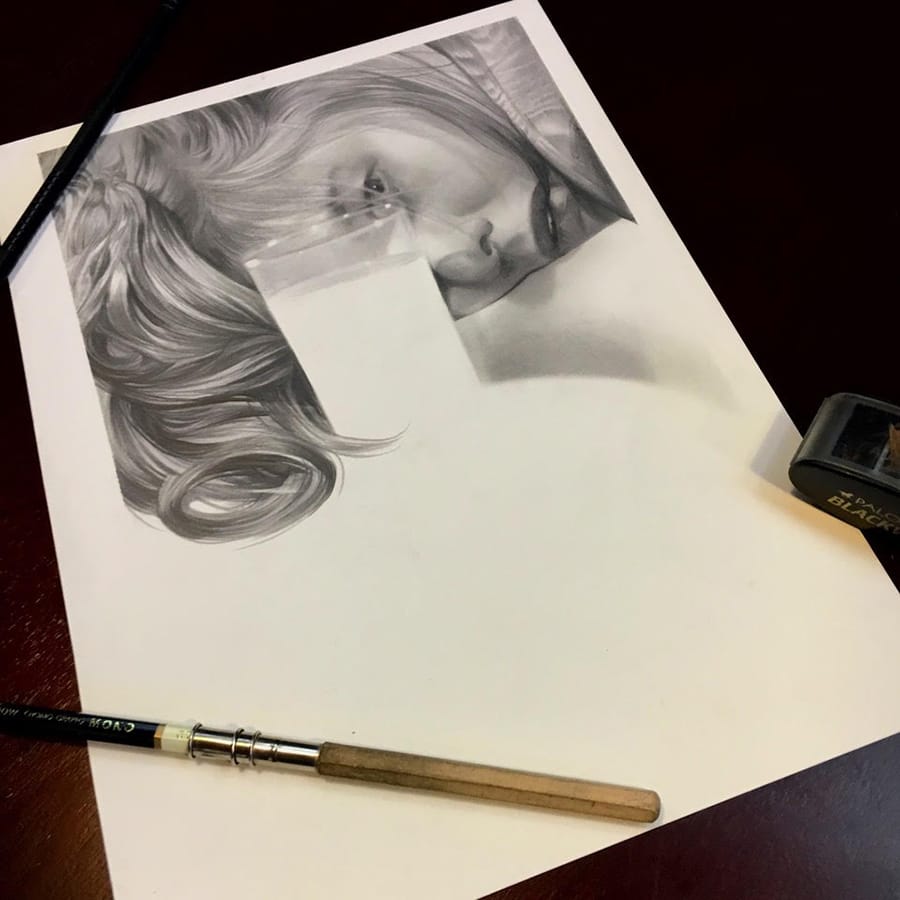
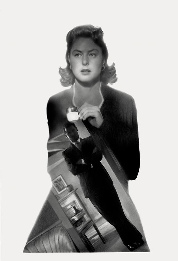
So right away this project became about compositional design and Ingrid’s emotions, the look of a stressed and terrifying moment, held in check by the pretense of casual intimacy. Eric and I knew after our recent work on the gorgeous noir Moonrise that we wanted to revisit the ideas I used in that cover drawing: pairing highly rendered natural forms and portraiture with the negative space of white cut-outs. We had a perfect symbolic element in the key’s shape, and we also had Raines’s black smoking jacket and Bergman’s white hands, that engagement ring showing us the betrayed promise, and her face . . . All along I kept in mind the inevitable location of given design elements like the Criterion “C” in the upper-left corner, the edition bar at the right, and the title treatment and credits.
I completed the final piece as a single graphite drawing, which included those intended flat and deep blacks, but it was always a given we’d be scanning it in, flattening those dark and white fields of tone and giving us the freedom to tweak and move and fiddle with these elements. It was the purest expression of everything I have ever been taught about artistic composition: directing the movement of the eye, which I learned from making comics; the simple craftsmanship required to render the characters so that they are recognizable as well as relatable; and leaving room for all the usual necessities the cover requires.
We had most of our back and forth around the idea of making the placement of Bergman’s hands natural, and the fact that in the absence of formal cues the viewer needed to believe the anatomy in front of them, no matter how hidden. We ended up reversing the original angle so the Criterion logo could land properly on the back of Sebastian’s noggin. That meant having to redraw the ring so it wasn’t on the wrong finger. Those little bits can be easily forgotten when flipping an image like this.
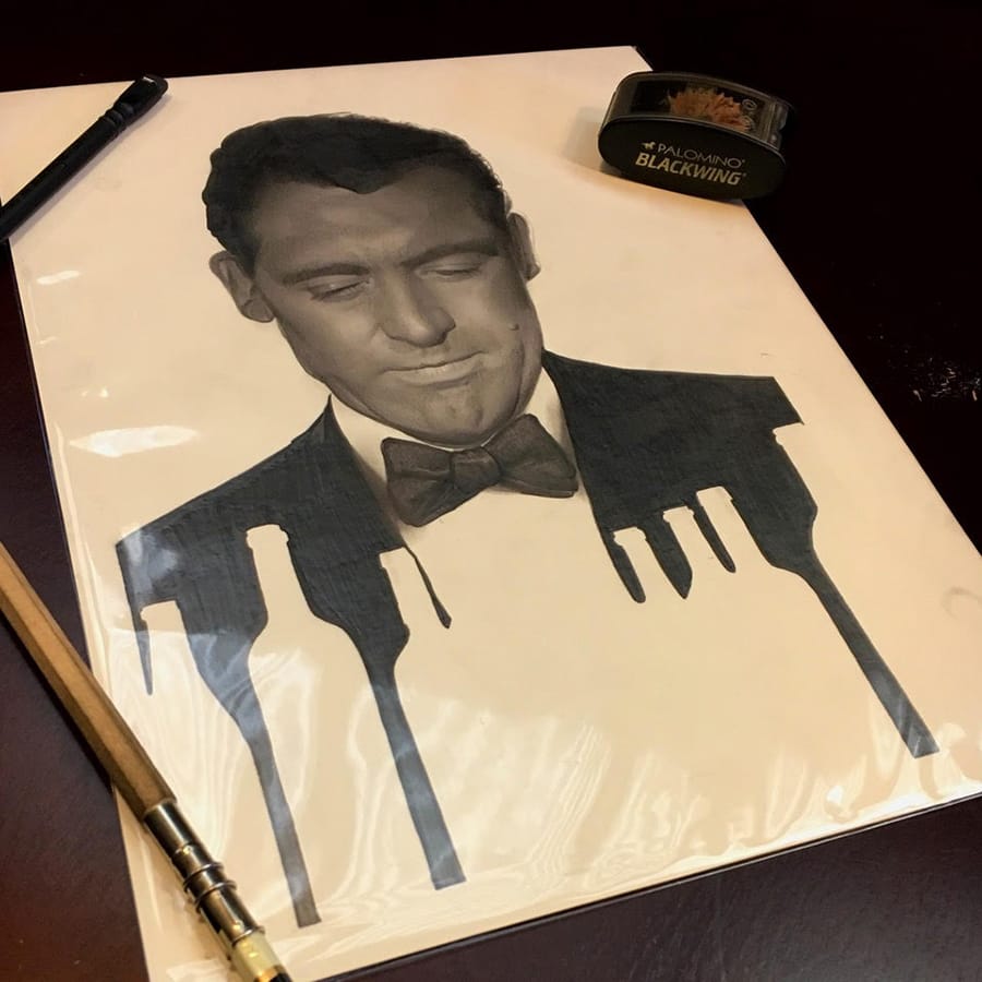
Others came as explorations of character, playing around with the double exposure technique, and furthering the black-and-white and cream tritone design. This one of Sebastian cast within the form of his domineering and terrifyingly dead-eyed mother was seen as being too cute where a simple portrait of Sebastian would do. Devlin and Alicia had been rendered in isolated portraits, and Claude Raines’s character deserved the same respect. So we went with a redo that had a sea of black contracting the solidity of Devlin’s form.

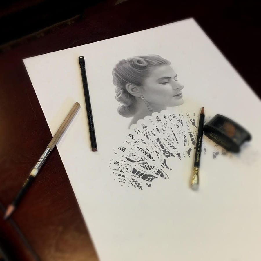
A few more portraits of Bergman herself were done. One was finished long after the initial art was completed for the project, and serves as a celebration of that original tea-cup pose that inspired me to chase down the long out-of-print DVD release.
In the end, somehow, I think we managed to hit the mark. While I can never tell if the work is good, I know it’s the best I could manage simply because I’m not able to think of a way to do it better. Sometimes that’s all we have to go on. This project was the rare perfect convergence of professional simplicity and personal geekery, and there are few projects that I can look back on with as much pure pride and satisfaction. All the usual worries, fueled by the desire to make sure it’s done right, never overcame the joy in doing it. I can’t wait for you all to see this in person and revisit this stunning masterpiece of golden-age Hollywood moviemaking.


More: Criterion Designs
Joao Rosa’s Experimental Approach to Designing Gummo
The creative director of Miami-based studio EDGLRD, which he cofounded with filmmaker Harmony Korine, describes the process of creating the cover artwork for Criterion’s recently released Gummo edition.

Capturing Arsenic and Old Lace, in One Macabre Image
To capture the spirit of Frank Capra’s dark screwball classic, Criterion enlisted a longtime collaborator to create an image that combines the influences of Old Hollywood illustrator Jacques Kapralik and legendary pen-and-ink artist Edward Gorey.

The Artistic Synthesis That Gave Bloom to Our Exotica Cover
For this new illustration, Spanish artist David de las Heras combined his signature use of bold colors with the lush style of French postimpressionist Henri Rousseau, a key visual influence on Atom Egoyan’s 1994 film.

David Plunkert Shares His Passion for Color and Shape
The graphic designer behind our covers for Diabolique and The Tin Drum takes us inside his Baltimore studio and his idea-driven creative process.